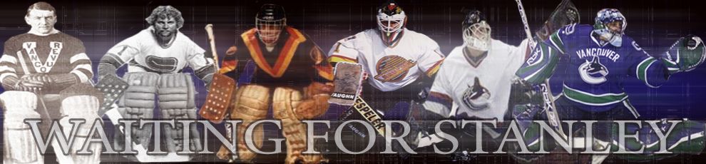
Canucks jersey poll
 I am suprised that so many people prefer to see Johnny Canuck on the new Canucks jersey. I thought the Stick in Rink would win by a landslide.
I voted for the Orca. I like the concept of it. The whale just needs to look meaner, as I've said before.
I am not so sure about the classic Johnny logo that Luongo has on his light brown mask. Johnny looks too jolly there, and not very intimidating. Intimidation. That is why the Sharks logo has always been my favorite. A revamped Johnny Canuck, still in his lumberjack theme, (not the superhero theme) that has an ax in one hand and a beer in the other, looking angrily drunk would suffice! Haha
I'm actually bothered that the red in the current jersey is being nixed. I liked the red trim.
On a separate note, for you, as a fan, doesn't it anger you at all that a new jersey is being released? Hell, you spend over $100 on a plain jersey and $200 for a personalized jersey (after taxes) and then they go and change the style on you. Is it worth it to even buy a jersey if you are not a collector? It's expensive.
Myself, I won't do it. And I definitely won't get a personalized jersey with the way players get exchanged nowadays.
I suppose a Luongo jersey would be a safe bet, but then the style change.....
6 Comments:
The skate finished below the stupid whale?
You people deserve to die!
The skate is sorely missed on my part as well. The black and yellow was cool.
But the Orca is still my fave.
I voted for the image of the guy being humped by a mule while trying to take a crap.
Doobie: That will be the Oilers' new logo someday. They're so good at fucking with people, that someday someone is going give it to them in the backside.
I love the retro Johnny Canuck, even with his happy, smiling touqued head. It harkens back to a by gone day of sport when the game mattered and not the biz.
I'm with you, I like the whale...and there is a certain nostalgia for the skate too. But, the colors of the skate were brutal. One could easily re-do the colors in the blue/white/silver tones they seem to be moving towards and have a decent looking logo.
I hate the stick in rink. A totally lame 70's attempt at a logo. I know there is supposed to be a 'C' there...but, can you see it? Horrid. The colors, on the other hand, are fantastic.
The colors of the Stick In Rick are awesome, yes. But you're right, that is one messed up "c" in that logo. I think the guy who designed that logo was on LSD.
Still, I haven't tired of that logo yet.
I like the running happy Johnny on a T shirt, but I still prefer an angry Johnny who looks like someone just hit on his wife.
It's all about intimidation for me I guess..
Post a Comment
Subscribe to Post Comments [Atom]
<< Home