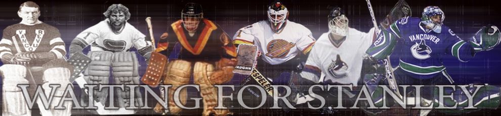
Bad news follows disappointing loss / Alternate Canucks Jersey
I'm not even going to talk about last night's game because that outcome was too predictable. The Canucks lack of size and finish became evidently clear. And yes, the Ducks are good.
The big news today is that Mattias Ohlund's season is officially over. He will have season-ending surgery to remove the bone chips from his knee.
"After further consultation with our team doctors it was determined that surgery was the best course of action," said general manager Dave Nonis in a statement. "The best long term decision for Mattias and our hockey club is to have this addressed immediately."Ohlund had 9 goals and 15 assists in 52 games for Vancouver this year. I am disappointed with this news. Why couldn't it be Bieksa? Ohlund's presence will be missed.

I recieved an email from GZ Expat today about an alternate Canucks jersey/logo with the pics pictures attached. Expat was emailed these images and the person stated:
The Canucks, without any major announcement, have an updated version of Johnny Canuck in their collection of secondary logos. In case you haven't seen it, it's a block letter V for Vancouver and at the top centre of it is the head of the original Johnny Canuck lumberjack. It is already trademarked by the team and the NHL.JJ mentioned that when the Canucks unveiled their new jersey last summer, they also trademarked a couple of logos as well, with the head and "V" (pictured) being one of them, and the other is a "V" kinda going through a "C".
This is all news to me. I like the logo but the green could be a little darker perhaps. What do you think?
T Tags: Mattias+Ohlund+out+for+season knee+injury Canucks+third+jersey Canucks+alternate+logo

Labels: Canucks
8 Comments:
You said, "lack of size and finish" . I think you meant, "lack of size and swedish" :)
lack of size and english...
lack of leadership and grit...
NO MORE SWEDES! (Unless their last name is Zetterberg or Lidstrom or Sundin..)
Those jersey's are okay.
I wonder why they won't goto the retro rink though.
I guess they feel that a change would be refreshing. I'm torn about the stick in rink logo. I do like it on the shoulders of their jerseys though.
I think a wholesale change would be a good idea. Just my opinion. And the fans can be the artists of the new concept with a winner being selected.
That logo on that photoshop looks so WHL-ish. Does not look like an NHL team logo (see Atlanta, Nashville, the old fisherman Islanders logos)
Maybe... I guess the running Johnny Canucks would be better, or maybe something similar to the Johnny that Luongo has on his mask. He's gotta look MEAN!!
Oh yeah, I can defeinitely see the resemblance in artwork with the Islander's fisherman logo!
Let's fuel the stereotype that all Canadians are lumberjacks.
lol. So you'd prefer the beer drinking logo then? :)
Post a Comment
Subscribe to Post Comments [Atom]
<< Home