More new jerseys unveiled
 Keep it simple. Don't change a good thing, right? Montreal Canadiens new jersey slideshow.
 A cleaner look. But I'd like to have that Rockies jersey! Strange double color on the sleeves....
Avs blogger reactions:
Jerseys and Hockey Love
Jibblescribbits Sharp.
 Bye-bye bottom stripes. Almost makes it look too simplistic doesn't it?
 Mixed emotions about the Sabres jersey
"Leaked" new Penguins jerseys
T Tags: new+Leafs+jersey new+Penguins+jersey new+Avalanche+jersey new+Ducks+jersey new+Canadiens jersey
6 Comments:
With regards to the Leafs jersey's: it is a simple team, after all :-)
Really? I find them complicating!
shouldn´t there be an "A" on Campbell´s chest? Why doesn´t he shave himself once in a while? That would make a better impression with the ladies...
Vakfan, you miss nothing, do ya?
Some ladies like hairy men. My wife likes the scruffy look.
My wife likes the scruffy look.
Not. Going. To. Touch. That.
Must. Resist....
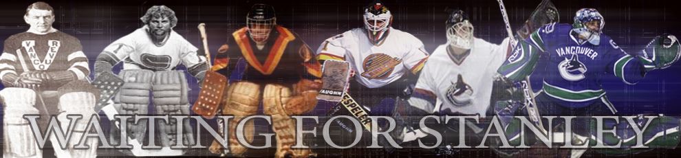
Why did you put up Montreal's jerseys. My eyes are burning - they have to be the ugliest jerseys in the history of Pro sports - they always were. Vancouver's flying "V" jerseys were better - I hate The Canadians and everything about them. Please do not post anymore Montreal images ever.
Post a Comment
Subscribe to Post Comments [Atom]
<< Home